Marisa's Top and Bottom 3 Godzilla Designs
I am also a dinosaur
I held off as long as I could, but it is finally time for me to unleash my opinion upon you, the fans. Yes, that’s right. This article is all about my top and bottom 3 Godzilla designs. I am prepared for the backlash, the hate mail, the lost followers! But I’m entitled to my feelings.
Let’s dive right in, starting with the worst.
The Worst
3. GyakshuGoji
GyakushuGoji, why your fins so weird?
If I am being completely honest here, the only thing that I do not like about this suit is the two oversized fins that look so out of place. There’s a third large fin that looks… broken? They just don’t seem ‘natural’ and don’t blend very well with the others on the back. For me it distracts from the entire suit. I can’t seem to retract my gaze from these giant, protruding fins. It forces me, as the audience member, to think of reasons the fins are so large, but the monster itself so thin. How does this work? Why is it like this? I wish I could explain why it bothers me so much. By and far, this is not the worst suit, but it is so visually distracting to me, and that earned it the #3 spot on my worst list.
2. Megalon Goji
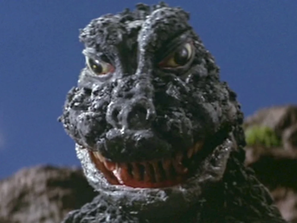
Hello fellow kids, it is I, Megalon Goji!
What am I looking at? This strange, ape-faced lizard monster is the stuff of childish nightmares. The scaling they tried on this suit looks more like nasty, matted fur. This design is so kid-friendly I don’t even understand why they bother to make him roar in the movies he’s in it’s so hilariously bad.
Furry Goji is worst Goji.
There is nothing threatening about this monster, other than it’s size. It’s… pathetic. However it does make me smile, albeit in a ‘what am I doing with my life that has me looking at this terrible thing’ kind of way.
1. MusukoGoji
KILL IT WITH FIRE
This was a seat of some contention, while I am the type of person that can find something wrong with EVERY Godzilla design. But I had to go with a fan favorite. What can be said about this frog-faced, pebble-skinned monstrosity? It’s just… so… bad. I respect the people who design and build these suits, I really do, but what were they thinking here? This face doesn’t even look like a lizard or a reptile… it’s disturbingly human and yet they eyes are so empty and lifeless.
Quick! Bury it before it gets up!
Just… just go away MusukoGoji! Don’t haunt me anymore!
Now it's time for my favorites!
The Best
3. BatoGoji
So cuddly.
I really like this design. There’s this classic Godzilla feel to it, but it’s still menacing. The face is a bit dog-like, with his tiny ears in the back, and the rounded snout, but it flows well into the neck.
These spines really attracted me to this design.
The combination of skin and bone on the spines is something I didn’t expect to find so attractive, but it works really well on this design. I love this Godzilla’s hour-glass figure, because representation matters and the chunky looking Gojis tend to be the grossest ones as well. They managed to do the classic pebbling on this suit without it looking like matted fur (see Megalon Goji), and it all just works really well.
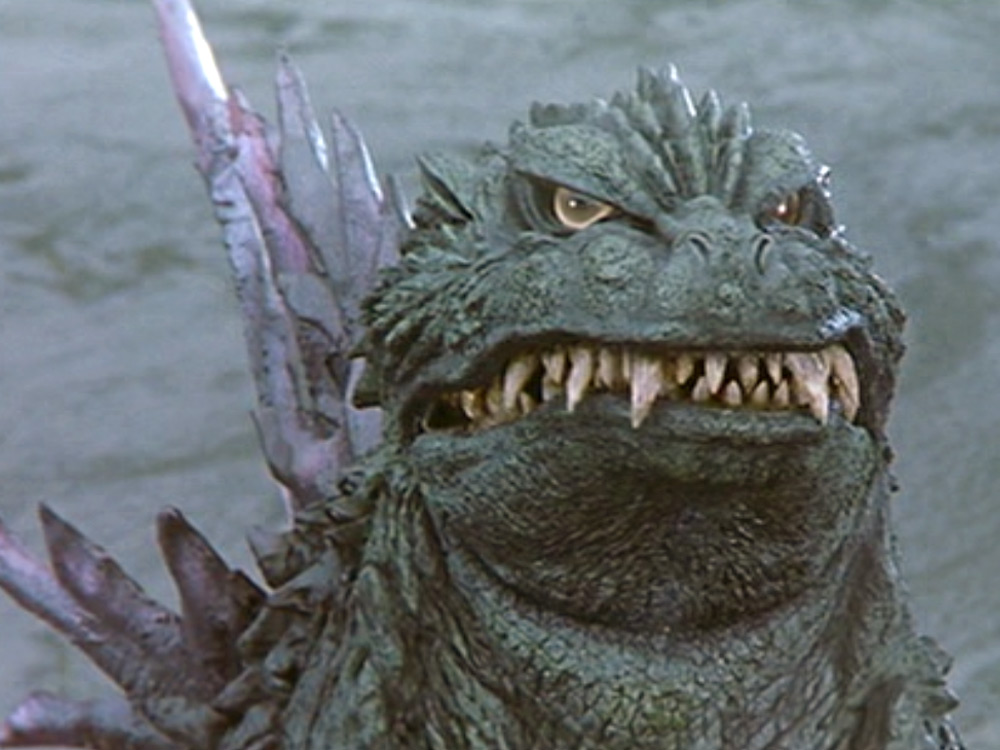
2. BioGoji
Talk about thunder thighs
I only managed to find one design I liked better than this one, and that was tough enough. The head is angular, and actually-finally-thankfully well-proportioned in regards to the body! The spines have that blend of bone and skin, they are sized correctly for their position, and they have this intriguing clumping that none of the other designs had. This Godzilla is also chunky, it’s got large thighs, needed to support its massive weight, and a broad chest
Looks like some sort of water doggo.
Overall it has a well-balanced look to it that is new and classic combined. The only thing that kept this design from being my number one pick was the sagging. It doesn’t sit very well and in a lot of stills it looks like Godzilla has some ill-fitting pants on.
1. MireGoji
Yassssss
I know how awful this design is in practice, but I cannot deny how awesome it looks. The jagged spines, coupled with the sharp, angular scales, and the angularity of the snout made for a pretty terrifying Godzilla. However even I can point out that, though this is one of my favorite designs, it looks dumb with the mouth closed.
You know he just opened his camera app and it was front facing and- wait, have I made this joke before? Oh well, you gotta herp before you can derp!
But that doesn’t detract from the overall look and feel of the design itself. Still shots of this design are unique and somewhat breathtaking. The colored tips of the spines make it feel like MireGoji has crystals protruding from his back, and the oversized ones FIT instead of detracting from the feel. There are so many cool things to talk about on this design, it’s hard to find yourself focused on a singular flaw for too long.
Demonic Goji here stole my heart.
Bonus round:
FinalGoji: What is wrong with the neck here? Am I the only one seeing this? There’s just something… wrong about it.
RadoGoji: I’m 100% trying to be body positive by saying this but… he got them leg rolls.
Shoshingeki Goji: So… at some point they just said ‘screw it’ and his face looks like Rocky Balboa after he fights Ivan Drago.
84Goji: I see a lot of things I like here… but the toes. The toes are so strangely sized and designed compared to his hand-claws.
SokogekiGoji: More like Doggo-Goji.
2014 Godzilla: I don’t care what you say, I love how he looks like he can give a good hug and kill your family with a strait face.
And there you have it! So what do you think? Agree, disagree? Have I become your enemy? Let me know it the comments!


